Global sea ice area : a scary plot

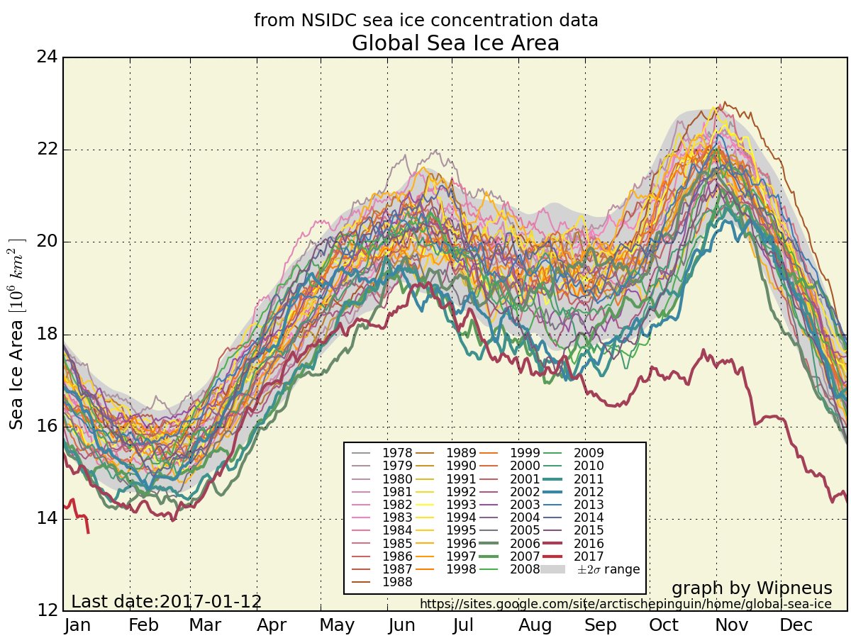
When I say « a scary plot », I don’t mean a Chinese plot aimed at confusing some naive North Americans, it just mean a figure (an American one, by the way, made with data from the National Snow and Ice Data Center) that provides the total sea ice area over the globe. And this figure is scary :

The red curve corresponds to last year’s sea ice area.

Let’s hope it is partly due to the el-niño phenomenon we had last year, and that next years will come closer to the average curves. However, as a cold wave is about to reach western Europe, let’s record it for later !

Plus d'actualités

Rapid analysis of the GLOF in Gupis, Gilgit-Baltistan

Pakistan news media reported that a glacier lake outburst flood (the failure of a dam containing a glacial lake) occurred near Gupis, Gilgit-Baltistan, a highly mountainous region administered by Pakistan. Satellite images show that the flood triggered a debris flow, which reached the Gupis valley where it hit the Roshan (Rashon) village and blocked the […]

Évolution du jour de déneigement dans les Alpes françaises et les Pyrénées

Les socio-écosystèmes des Alpes et des Pyrénées dépendent étroitement des fluctuations annuelles du manteau neigeux. En particulier, le moment de l’année où la neige disparait détermine le début de la saison de croissance de la végétation de montagne et donc la période des estives. Le changement climatique est en train de bouleverser ce rythme saisonnier. […]

BIOMASS, the third launched satellite mission designed at CESBIO !

After SMOS in 2009, and VENµS in 2017, the CESBIO laboratory is very proud to see its third proposed mission, Biomass, reach orbit. As always, it has been a long journey from the idea, at the beginning of the century, to the selection in 2013 as the seventh Earth Explorer Mission by ESA, to the […]

Rechercher